Map of the Internet
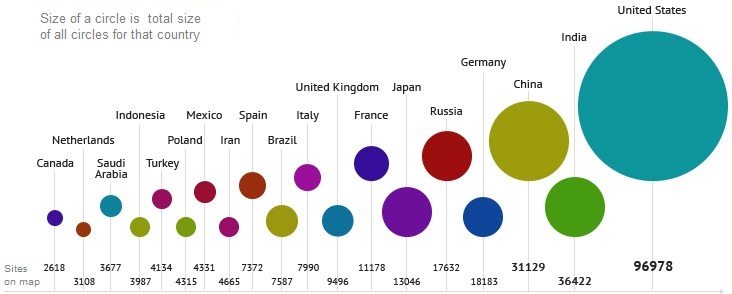
Ever wanted to see a visual representation of the internet and it’s traffic from 2011? The Internet Map does just that. It has coloured the 350 thousand websites into countries and the size based on the website traffic. Its quite amazing to look at.
Below is the key for the colours that represent the country, some of it maybe questionable. (Red for Russian, yellow for China?)


